Colour Collection - Upside Down
Pure & Original is a Dutch, family-owned premium paint brand, best known for their organic mineral paints, including Classico chalk-based paint, Fresco lime paint and Marrakech Walls.
The colours associated with the brand are usually muted shades of grey, beige and white, which have been driven to perfection over many years.The hidden gem of Pure & Original’s colour collection are the bright colours – the jewel tones, the earth tones and the pale tones, with sophisticated nuances that are oh so difficult to achieve. By using only natural colour pigments, this collection will reflect the colours in a richer and a deeper way than is possible with traditional paints made of synthetic colour pigments. Not only will the surface get a feeling of richness, it appears touchable, soft and even the brightest colours have a surprisingly calming effect.
Pure & Original has teamed up for the third time with colour designer Dagny Thurmann-Moe from KOI Colour Studio in Oslo, Norway. For the 2020 collection, we also decided to team up with Siri Zanelli from London based architectural firm Collective Works.
Black Hills Blue Green Room Hop Kiwi White Lagoon Water Mauve Love Nutmeg Powder Old Ocre Old Rose Olive Drab Poetic Blue Polar Blue Sea Moss Skin Powder Soft Flamingo Soft Greek
Dare with colour
“We wanted to create a collection that has both personality and flexibility – the colours we included can create a large variation of different looks and work with different types of architecture”, explains Iris Floor, Creative Director of Pure & Original.
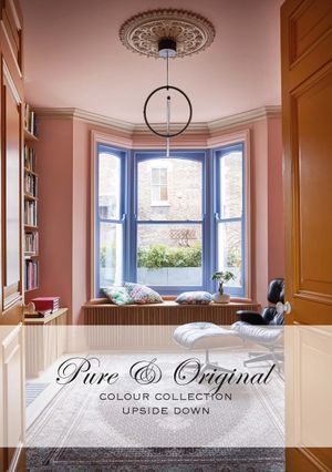
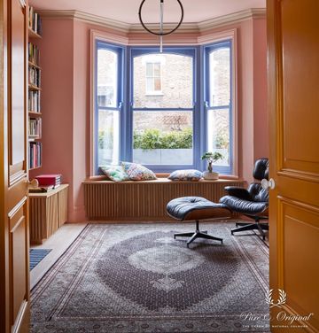
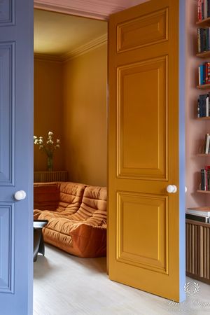
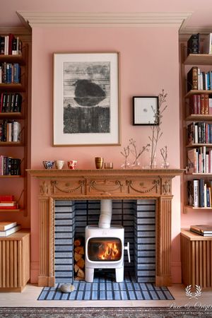
The current collection moves from various shades of dusty green, to peachy shades of pink, to the most saturated ochre, over to lavender and the vivid Yves Klein blue. This collection has a wild mix of colours, and can be used to create calm, eccentric, historical and modern palettes.
We wanted to shake things up a bit with this collection.
Find a reseller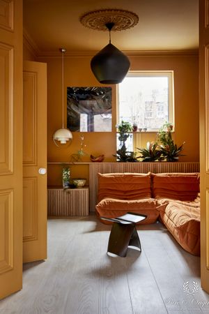
The story of Dagny, colour expert
Where did you find your inspiration?
When I first saw the terrace house, I was incredibly excited – it had a huge personality, and Siri was very keen on keeping all the details that tell its story, but also adding new details, that continue telling the story. It’s an ideal starting point for the development of the collection.
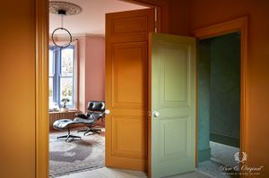
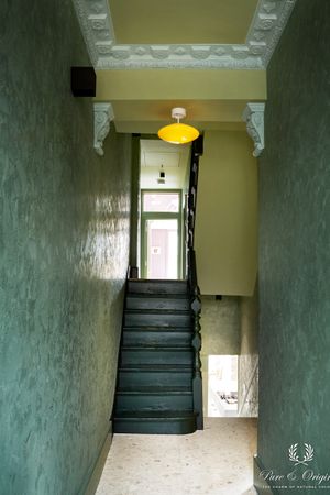
My inspiration is the architecture, and as always, Pure & Original’s extensive colour library. This time it was especially interesting to interpret both the colours and the use of colours of the Victorian era but apply it in a contemporary manner. The architectural era of the Victorian terrace of course plays a significant role in developing the colours for the collection. I love the fact that Pure & Original has natural colour pigments, which again makes it easier to reference the historical use of colours. We wanted to pay hommage to the Victorian era, so the colour combinations are in several rooms quite complex. We did not apply the approach to all rooms, as that can be too much, so we balance between high and low complexity in the different rooms – the highest degree of complexity is actually in the hallway.

Can you tell something about the used colours?
Each room has a litte surprise. I’m not going to let you know what here, but if you study the photos carefully, you’ll probably be able to spot them.
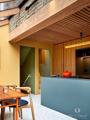
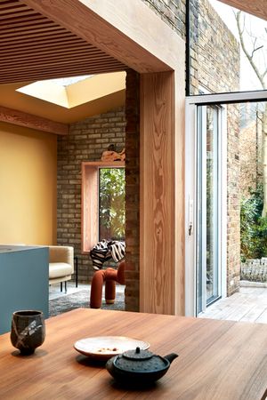
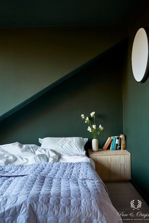
We avoid black, white and grey tones as they create to high levels of contrasts – it’s easier to create a harmonius and relaxing look if you avoid greyscale, which is in high contrast with the colour circle.
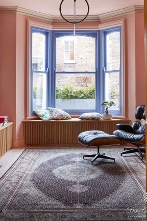
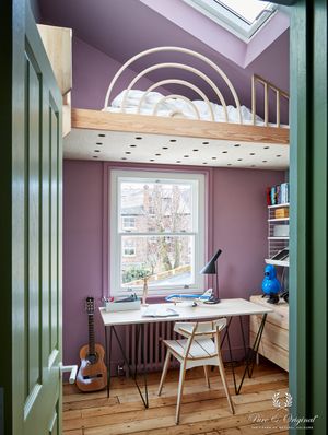
Why did you pick a blue-ish purple for the windows in the front living room?
I wanted to do something unexpected with the front living room. It could easily be just pretty, but I wanted something more. Something you have to analyse, and then decide for yourself, if it’s something you like or not. I personally love it.
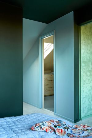
We combined both warm and cold colours in the same colour palettes in different rooms, because it can create a more “full” look, as only staying at one side of the colour wheel, can in some instances make a space seem too cold (or sterile/depressing) or too warm (stressful, too much energy). It’s not always needed, but, when it is, it can create a sense or calm, perfection or just interesting contrast.
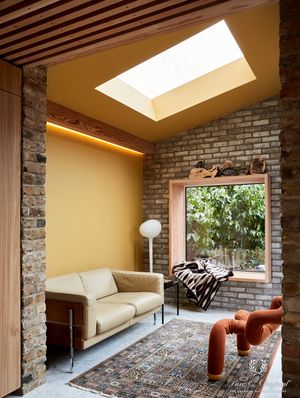
Why are there no white ceilings?
I avoid white ceilings in my projects, because they create too high of a contrast towards the colours on the walls and the rest of the interiors – it’s like having a giant iceberg on top of the interior.
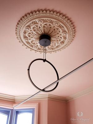
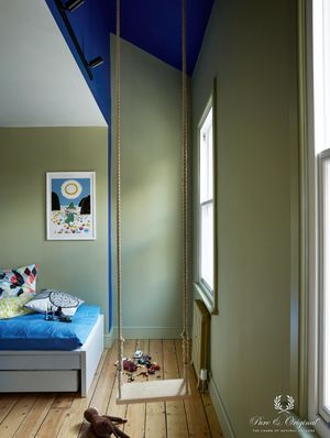
Why did you paint the blue secret ceiling?
Pure & Original’s Blue, is such a bright and saturated colour, it reminds me of the legendary “Yves Klein Blue”. It has absolutely nothing to do with the Victorian era, but is such a fun surprise, that you can only see when you’re standing in the middle of the room – it’s invisible from the doorway, and it also enhances the modern touch of the ceiling.
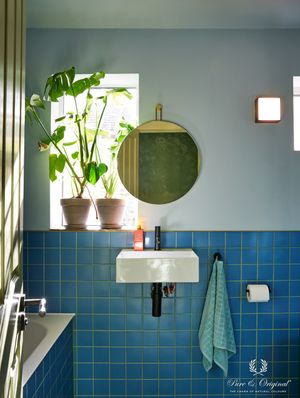
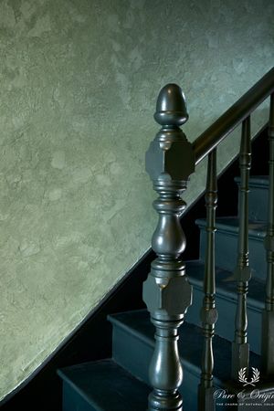
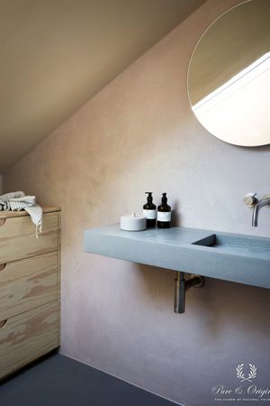
What can you tell about the used paint types in the hallway and the bathroom?
The Marrakech Walls quality is usually seen in grey or beige, and with the Italian high gloss Wax, it just makes the walls into a piece of art from themselves. We decided to use a brighter colour of green, and the effect of the paint looks much like Tadelakt – very old, beautiful and with an amazing patina. It’s the jewel of the house.
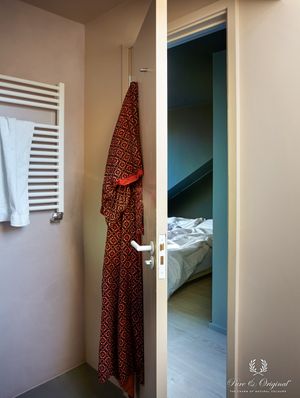
I love to use washable wall paint in bathrooms and here, it’s like the icing on the cake. Soft, pastel tones, that perfectly blend in together, none of them making a statement, but together, all of them creating something magical.