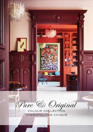
Colour Collection - Cosmopolitan Chique
Pure & Original is een Nederlands verfmerk met een uitgebreid assortiment verfsoorten en kleuren, gemaakt met respect voor mens en natuur. Al onze verf wordt gekleurd met 100% minerale pigmenten, en ook de basis is zo veel mogelijk mineraal. Het is dan ook niet gek, dat onze meest bekende verven en kleuren, natuurlijke zijn. De Classico krijtverf en Fresco kalkverf, vaak gekozen in natuurlijke grijze en beige tinten voor een landelijke, huiselijke sfeer.
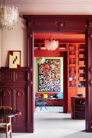
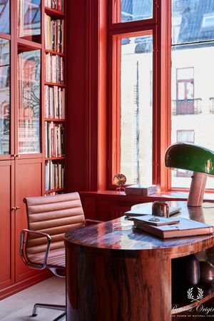
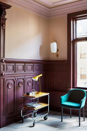
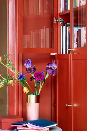
Maar naast deze vergrijsde, natuurlijke kleurtonen hebben wij nog meer! Dit laten wij zien met onze eerste ‘Colour Collection’: ‘Cosmopolitan Chique’ genaamd. Een selectie kleuren die elkaar prachtig aanvullen, en een bijzondere sfeer neerzetten. Met deze collectie hebben wij gekozen om aandacht te geven aan kleur. Een overdaad aan volle, rijke kleuren. Een variatie van zacht roze met een fluweel zachte uitstraling, diep paars vol van kracht, spiegelglad rood, tot een heel scala blauw nuances in betonlook.
De kleuren; zo zacht, diep, vol en intens. Komen het beste tot zijn recht dankzij de natuurlijke pigmenten. Je zou haast verdwijnen in de kleuren, en de muur om je heen willen wikkelen als zachte, warme deken.
Om deze ‘Colour Collection – Cosmopolitan Chique’ het best tot zijn recht te laten komen, heeft Pure & Original samen gewerkt met een creatief team in Noorwegen.
‘Als we kijken naar de toekomst, en hoeveel kleur dat ons gaat brengen, is het een logische stap voor ons om ons te gaan richten op het toepassen van meer uitgesproken kleuren. De kleuren uit deze inspiratie collectie hebben wij altijd al gehad, maar deze keer hebben wij gekozen om ze als statement tot hun ware recht te laten komen. Een diversiteit aan kleurtonen die elkaar geweldig aanvoelen. Er is rust en eenheid, zonder ook maar een beetje wit of grijs.’
Skin Powder Old Rose Brown Red Old Wine Praline Ocre Landscape Belgian Wilderness Black Hills Steel Blue Polar Blue
Durf met kleur
The future of colour is bright! We’re heading towards the most colourful era in decades, and I absolutely love the freedom and “break all rules” attitude that’s increasing in popularity. Old neutrals will eventually be replaced by green, blue and brown, and we’ll be seeing a more playful, complex and elegant approach to colouring our surroundings.’
Durf meer kleur in huis te halen
Vind een verkooppunt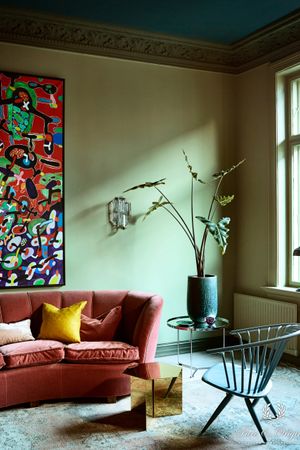
The story of Dagny, colour expert
‘I have to admit that I felt like a kid in a candy shop. I’ve been using Pure & Original’s colours for a long time for various projects and the brand is one of the best in the industry when it comes to making high-quality colours that last over time. In a sense, many of them are not “one season wonders”, but they have a sense of longevity that I really appreciate. This project, where the objective was to show a new and bolder side of the Pure & Original brand, was extremely interesting and rewarding.
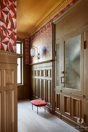
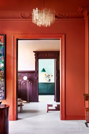
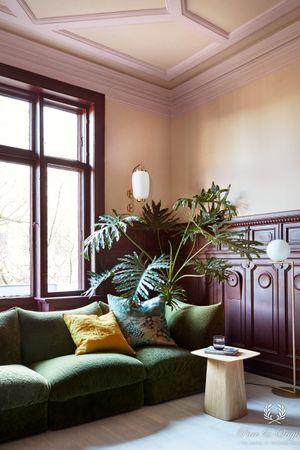
Pure & Orignal has always had an elegant quality to the brand and image material. I wanted to keep the elegant feel, but with a bit of eclecticism and bold colours. The process started with finding the right location – I knew I wanted high ceilings and interesting architectural features with big windows, not to mention the right owner. The owner is important, because I wanted the end result to stay – and to match the person living there. Thankfully, we found a perfect match – the owner’s sense of aesthetics matched exactly the look we wanted to go for.

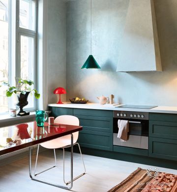
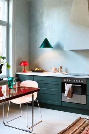
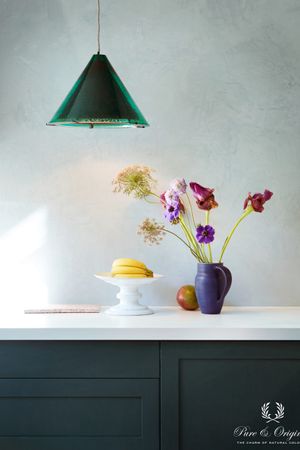
What I love about all of Pure & Original’s qualities, is the natural colour pigments. They give the colours a deeper and more intense feeling, while at the same time synthetic pigments are unable to achive that same nuance richness. We’re approaching a new colour era, that includes almost the entire colour wheel. The biggest trend is that there are no trends, personal choices and personal style will become the most attractive feature in a home. Here, I wanted to show a more complex use of colour, that inspires the customer to think outside the box, and also use colour on window frames, ceilings and not shy away from the bolder colours – if used correctly, they can also feel incredibly relaxing and calm. One of my favourite paint qualities is Classico, ultra matte, with a fabric-like kind of richness to it. The colours look so good that you want to touch them (no, not kidding, it’s really amazing). A new favourite is the Marrakech Walls quality that we used on the kitchen walls. It looks a bit like chalk paint, but it’s more like tadelakt, and has a very shiny surface. It’s such a great contrast to all the matte paint qualities, and is also incredibly touchable. My aim was to create a kind of “hug the walls” experience, and I think we succeeded in that.
It feels exactly how I pictured it in my head. I never decide on actual colours before we start, but I always have a sense of what I want it to feel like. I had some ideas of what colours to use, but I never decide 100% before I do a tour of the location and talk to the owner. Thankfully, the owner of the house loved the initial ideas and we ended up going for all of the suggestions I made in the first draft (although we did have some lengthy discussions regarding some of them, even making optional palettes). I’m very happy that Pure & Original and the owner ended up loving the campaign look and colour design.
The future of colour is bright! We’re heading towards the most colourful era in decades, and I absolutely love the freedom and “break all rules” attitude that’s increasing in popularity. Old neutrals will eventually be replaced by green, blue and brown, and we’ll be seeing a more playful, complex and elegant approach to colouring our surroundings.’