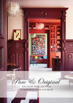
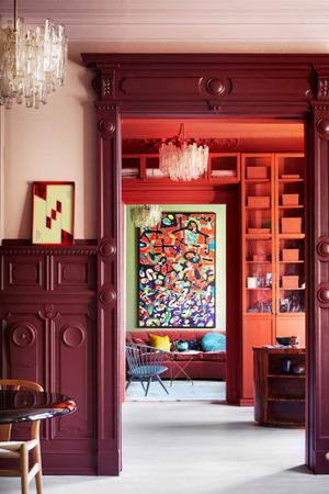
Collection de couleurs - Cosmopolitan Chique
Pure & Original est une marque de peinture avec un assortiment large de sortes de peintures et couleurs, élaborées avec respect pour l’homme et la nature. Toutes nos peintures sont colorées avec 100% de pigments minéraux et la base est aussi la plus que possible minérale. Ce n’est alors pas étonnant que, nos peintures et couleurs les plus renommées sont naturelles. La célèbre Classico peinture à la chaux et la Fresco peinture à la craie sont souvent choisies en teints gris et beiges afin de créer une atmosphère rurale et domestique.
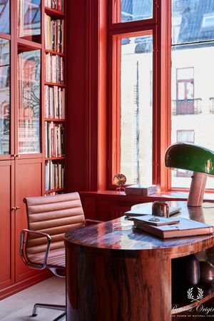
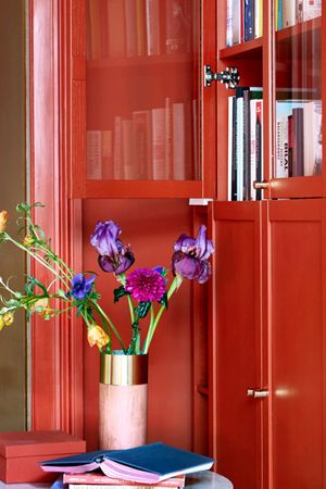
Mais à côté de ces tons grisâtres, tons naturels, nous avons encore beaucoup plus! Nous le montrons dans notre première collection nommée ‘Colour Collection’: ‘Cosmopolitan Chique’. Une sélection de couleurs qui se rejoignent harmonieusement et créent une atmosphère spéciale. Avec cette collection nous avons choisi de donner de l’attention à la couleur. Une abondance de couleurs riches et profondes. Une variation de rose doux avec un éclat de velours, du mauve profond plein de force, du rouge miroir lisse, jusqu’une variété de nuances bleues en effet béton.
Les couleurs tellement douces, profondes, volumineuses et intenses. Ces couleurs se mettent le mieux en valeur grâce aux pigments naturels. Vous vous perdez presque dans les couleurs et vous avez envie de vous envelopper du mur comme une couverture douce et chaude.
Pour rendre la meilleure justice à ‘Colour Collection – Cosmopolitan Chique’, Pure & Original a travaillé ensemble avec un team créatif en Norvège.
‘si nous envisageons le futur et la quantité énorme de couleurs qu’ il nous apportera, c’est un pas logique à nous diriger vers l’application des couleurs plus frappantes. Les couleurs de cette collection d’inspiration ne sont pas nouvelles, mais cette fois-ci nous avons choisi de les rendre la meilleure justice en étant plus explicites. Une diversité de nuances de couleurs qui se complètent magnifiquement. Il y a de la sérénité, unité, sans le moindre du blanc ou du gris.
Skin Powder Old Rose Brown Red Old Wine Praline Ocre Landscape Belgian Wilderness Black Hills Steel Blue Polar Blue
Osez la couleur
L’avenir de la couleur est prometteur! Nous nous dirigeons vers l’ère la plus colorée depuis des décennies, et j’adore l’attitude de liberté et de « briser toutes les règles » qui gagne en popularité. Les anciens neutres seront éventuellement remplacés par le vert, le bleu et le marron, et nous verrons une approche plus ludique, complexe et élégante de la coloration de nos alentours
Osez apporter plus de couleur dans votre maison
Trouvez un point de vente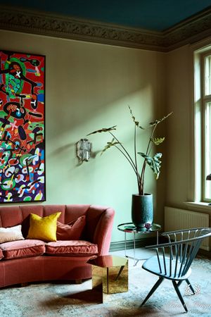
The story of Dagny, colour expert
‘Je dois admettre que je me sentais comme un enfant dans un magasin de bonbons. J’utilise les couleurs de Pure & Original depuis longtemps pour des projets divers et la marque est l’une des meilleures de l’industrie lorsqu’il s’agit de fabriquer des couleurs de haute qualité qui durent dans le temps. Dans un sens, beaucoup d’entre eux ne sont pas des « merveilles d’une saison », mais ils ont un sentiment de longévité que j’apprécie vraiment. Ce projet, dont l’objectif était de montrer une nouvelle facette plus audacieuse de la marque Pure & Original, était exceptionnellement intéressant et enrichissant.
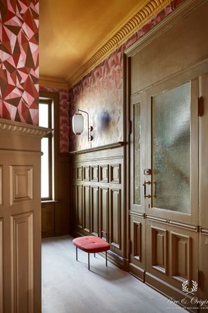
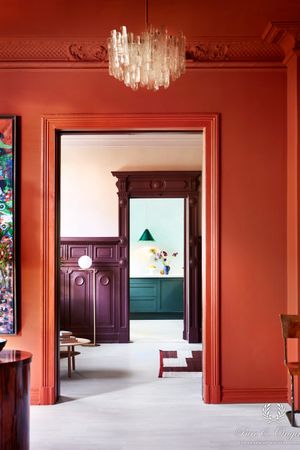
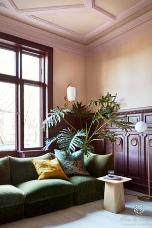
Pure & Orignal a toujours eu une qualité élégante pour la marque et un matériel de l’image. Je voulais garder l’aspect élégant, mais avec un peu d’éclectisme et des couleurs vives. Le processus a commencé par trouver le bon emplacement – je savais que je voulais de hauts plafonds et des caractéristiques architecturales intéressantes avec de grandes fenêtres, sans parler du bon propriétaire. Le propriétaire est important, car je voulais que le résultat final reste – et corresponde à la personne qui y vit. Heureusement, nous avons trouvé un match parfait – le sens de l’esthétique du propriétaire correspondait exactement au look que nous voulions atteindre.

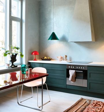
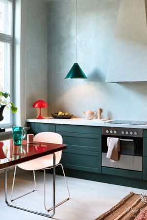
Ce que j’aime dans toutes les qualités de Pure & Original, ce sont les pigments de couleur naturelles. Ils donnent aux couleurs une sensation plus profonde et plus intense, tandis que les pigments synthétiques sont incapables d’atteindre cette même richesse de nuances. Nous approchons d’une nouvelle ère de couleurs, qui comprend presque toute la roue chromatique. La plus grande tendance est qu’il n’y a pas de tendances, des choix personnels et le style personnel deviendra la caractéristique la plus attrayante dans une maison. Je voulais montrer ici une utilisation plus complexe de la couleur, qui inspire le client à sortir des sentiers battus, et aussi utiliser la couleur sur les cadres de fenêtres, les plafonds et ne pas craindre les couleurs plus audacieuses – si elles sont utilisées correctement, elles peuvent aussi être incroyablement relaxantes et calmes. Une de mes qualités favorites de peinture est Classico, ultra mate, avec un apparence de richesse tissue dedans. La couleur est tellement belle que vous ayez la volonté de la toucher (non sans blague, c’est vraiment formidable) une nouvelle favorite est la qualité Marakech Walls que nous avons utilisé sur des murs de cuisine. Il ressemble un peu au tadelakt et a une surface très brillante. C’est un si grand contraste avec toutes les qualités des peintures mates et est également incroyablement touchable. Mon but était de créer une sorte d’expérience « embrasser les murs », et je pense que nous y sommes arrivés finalement.
Il se sent exactement comme je me l’imaginais. Je ne me décide jamais des couleurs réelles avant de commencer, mais j’ai toujours une idée de ce que je veux obtenir comme ressemblance. J’avais quelques idées sur les couleurs à utiliser, mais je ne décide jamais à 100% avant de faire une visite de l’endroit et de parler au propriétaire. Heureusement, le propriétaire de la maison a adoré les idées initiales et nous avons fini par accepter toutes les suggestions que j’avais faites dans la première ébauche (bien que nous ayons eu de longues discussions concernant certaines d’entre elles, même en faisant des palettes optionnelles). Je suis très heureux que Pure & Original et le propriétaire aient fini par aimer le look de la campagne et le design des couleurs.
L’avenir de la couleur est prometteur! Nous nous dirigeons vers l’ère la plus colorée depuis des décennies, et j’adore l’attitude de liberté et de « briser toutes les règles » qui gagne en popularité. Les anciens neutres seront éventuellement remplacés par le vert, le bleu et le marron, et nous verrons une approche plus ludique, complexe et élégante de la coloration de nos alentours.