Pure & Original x KOI Colour Studio Capsule Collection Natural High
In the far north, where nature is still untamed and grand, the Lofoten Islands rise from the sea. Here, between mountain peaks and shimmering fjords, a quiet intensity reigns.
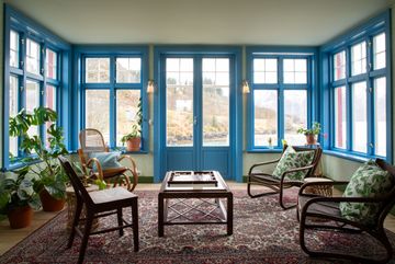
For Natural High, we photographed the colours on Brakøya in the Lofoten Islands. It is a rugged, layered, yet simultaneously understated and spectacular place, where old and new, colour and pattern, weathered materials and refined details coexist naturally. This made it a beautiful setting to showcase the collection in use, not as individual colour swatches, but as part of real and complex interiors. For us, that is ultimately what a good colour collection should do: give people the tools and the confidence to create spaces that are personal, complex, and timeless.
Natural High is the third and final of three Capsule Collections developed in collaboration with KOI Colour Studio. The complete Capsule Collection, consisting of New Dawn, Grounded Beautitude, and now Natural High, comprises 26 colours. These colours were never intended as standalone statement colours but as part of a larger palette with different functions, temperatures, saturation levels, and intensities.
Our approach to colour revolves largely around relationships. A colour is never experienced in isolation. Its meaning changes depending on the surrounding colours, the materials it interacts with, the architecture, the light, and in the way a space is used. Some colours need to be subdued and supportive, others can carry a space, and sometimes it is precisely the unexpected contrast that makes everything fall into place.
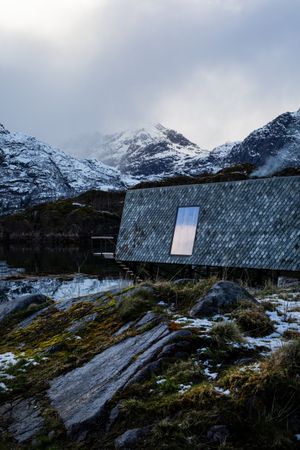
Brakøya is not an island that can be tamed. Here, nature dictates the rhythm of the day. The wind sweeps freely across the rocks, the ocean pounds tirelessly against the shore, and the light shifts in character every hour. In the Lofoten, the seasons are defined not merely by temperature, but by colour, texture, and contrast. Every moment tells a different story.
Here, colours are not created at a drawing board; they are shaped by the elements. Salty seawater softens wood and stone into gentle shades of gray. Moss and lichen bring deep greens to life on ancient rock faces. Mist casts a veil of cool blues over the landscape, while the low-hanging sun paints the mountains in warm earth tones; copper, ochre, and soft pink. Even the dark winter boasts a rich palette, where charcoal, slate, and the dancing Northern Lights converge.
On Brakøya, colour is not mere decoration; it is a reflection of nature itself. From weathered fishermen’s cabins to the interwoven hues of sand, stone, and sea, everything exists in harmony with its surroundings. Nothing feels forced. Everything has been shaped by time, wind, rain, and salt.
It is precisely this pure, unpredictable beauty that inspires. It reveals that the most beautiful colours emerge when nature is given the space to do its work. Not perfect, but authentic. Not fleeting, but timeless.
Applying the colours from the Natural High Capsule Collection to a place like Brakøya translates feeling into colour: shades that capture the serenity of misty mornings, embrace the warmth of weathered wood, and reflect the depth of the North Atlantic Ocean. Colours that not only transform a space but also evoke the feeling of a place where nature, light, and life have been inextricably linked for centuries.
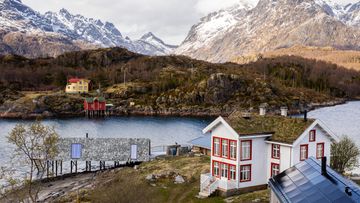
Brakøya - Lofoten, Noorwegen
Brakøya is not an island that can be tamed. Here, nature dictates the rhythm of the day. The wind sweeps freely across the rocks, the ocean pounds tirelessly against the shore, and the light shifts in character every hour. In the Lofoten, the seasons are defined not merely by temperature, but by colour, texture, and contrast. Every moment tells a different story.
Here, colours are not created at a drawing board; they are shaped by the elements. Salty seawater softens wood and stone into gentle shades of gray. Moss and lichen bring deep greens to life on ancient rock faces. Mist casts a veil of cool blues over the landscape, while the low-hanging sun paints the mountains in warm earth tones; copper, ochre, and soft pink. Even the dark winter boasts a rich palette, where charcoal, slate, and the dancing Northern Lights converge.
On Brakøya, colour is not mere decoration; it is a reflection of nature itself. From weathered fishermen’s cabins to the interwoven hues of sand, stone, and sea, everything exists in harmony with its surroundings. Nothing feels forced. Everything has been shaped by time, wind, rain, and salt.
It is precisely this pure, unpredictable beauty that inspires. It reveals that the most beautiful colours emerge when nature is given the space to do its work. Not perfect, but authentic. Not fleeting, but timeless.
Applying the colours from the Natural High Capsule Collection to a place like Brakøya translates feeling into colour: shades that capture the serenity of misty mornings, embrace the warmth of weathered wood, and reflect the depth of the North Atlantic Ocean. Colours that not only transform a space but also evoke the feeling of a place where nature, light, and life have been inextricably linked for centuries.
On Brakøya, nature proves every day that colour is more than what you see. It is what you feel.
Beach Breeze July Light Meadow Green Nebula Mint Taffy Morning Glory Poppy Burano Pink Matcha Latte Pink Oyster Nebula Lavender Fields Bushland Souk
Colour nuances for a personal interior
Natural High brings a gentle pause to daily life; a place where stillness, simplicity, and a slower pace can be felt once more. The hues are light yet layered, shaped by the forces of nature and the passage of time. They create interiors that let the tranquility of the outdoors flow in, evoking an open, breathable atmosphere.
Complementary colours used in this collection
The Natural High Capsule Collection features 13 new colours, complemented by seven existing colours from the Pure & Original collection and previous Capsule Collections, allowing for endless colour combinations.
Dagny Thurmann-Moe | KOI Colour Studio
“The collaboration with Pure & Original has enabled us to introduce colours and nuances that we believe are a valuable addition to the existing palette, while ensuring they harmonize beautifully with the colours already in place. Now that all three Capsule Collections have been launched, these relationships are becoming much clearer. The 26 colours can be combined both within the collections and with the broader Pure & Original palette, creating a cohesive, expansive system rather than just three separate colour schemes.”
– Dagny, KOI Colour Studio –
Add more colour to your home
Find a local reseller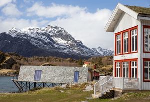
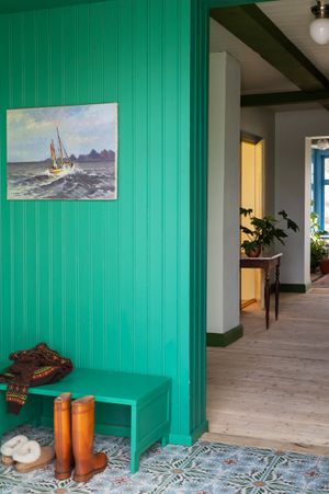
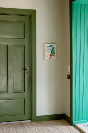
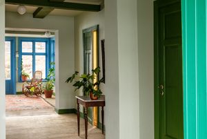
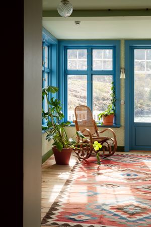
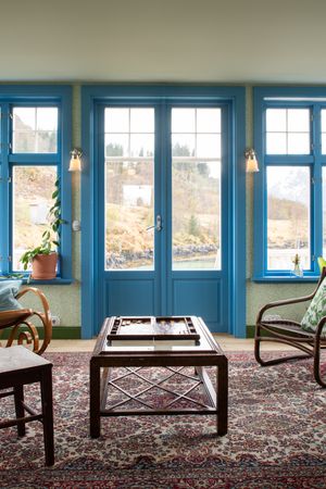
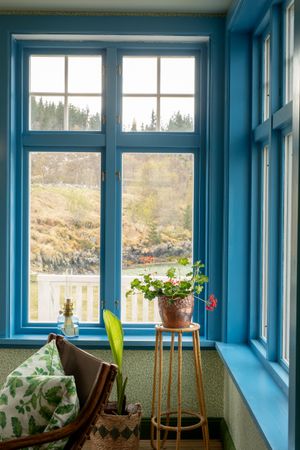
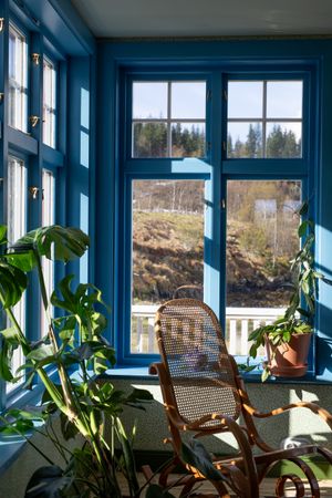
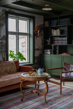
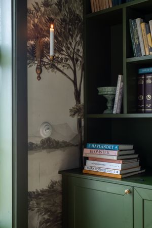
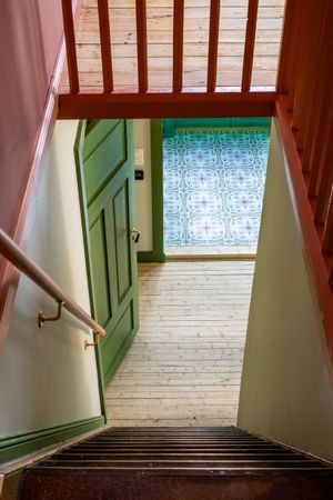
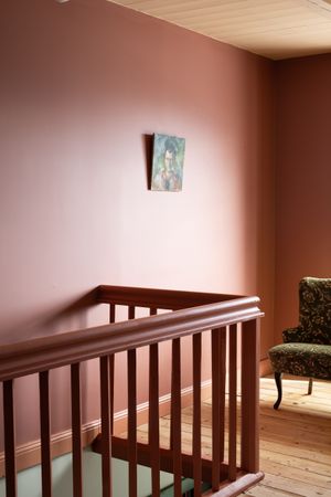
Eivind | Owner Brakøya
” I first visited Lofoten in 2003, when I was working on a documentary with the renowned philosopher Arne Næss, among others. I spent two months there on the film project, and the experience made a deep impression on me. I immediately began longing to return and started looking for a place of my own. In 2007, my partner and I bought a house in Digermul, the village nearest to Brakøya. It was a real Pippi Longstocking-style house. It took us about ten years to restore it, room by room. I started inviting people to the house so they could experience this beautiful archipelago. During that time, I frequently passed by this island and was truly frustrated by the way it was falling into disrepair. Through my contacts with many people, I came to understand how much the place meant to them and how saddened they were to see this old trading post rotting away.
Slowly but surely, I began maintaining this house without the owner even knowing, because I had somehow decided that I had to take on this project. You could say, then, that my connection to the island didn’t begin when we bought it; it actually started many years earlier, simply through being there and getting to know the place. And for me, it was never just about preserving the old building. It was about cherishing something I valued and finding a way to give it a future without losing what made it so special.
I feel that everything here is iconic in a way, because it is overwhelming everywhere; the mountains, the sea, the sky with its constantly shifting light, the weather, and the tides. Everything here is in constant flux. Even the colours of the landscape change dramatically throughout the day. It calls for a different way of being present on this island. We wanted the building to reflect that presence and connection, and we did not want it to compete with nature.
It was important to us that the materials in the house reflected the same philosophy as the rest of the project. They had to be natural, tactile, and connected to the location. Pure & Original was therefore a very logical choice. During the project, we had the opportunity to collaborate with KOI Colour Studio and Dagny. I can safely say that this took the entire colour concept to the next level. But perhaps the most special aspect for me was experiencing what the colours actually do to the house. They don’t just decorate the rooms; they transform the way you experience them.
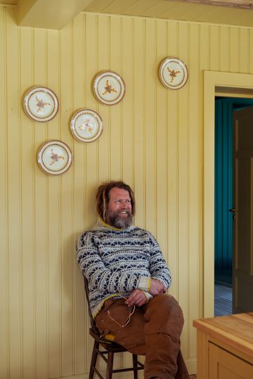
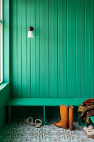
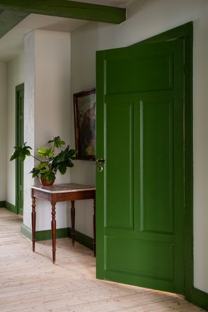
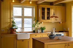
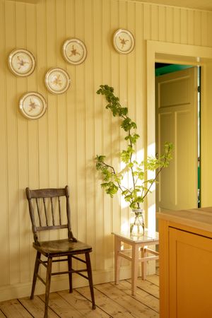
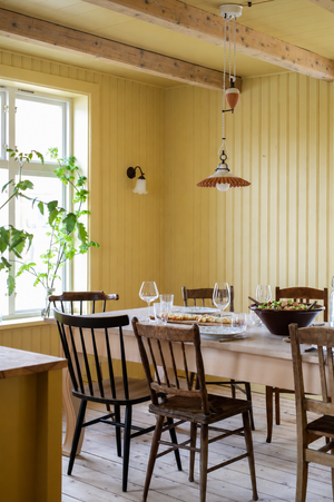
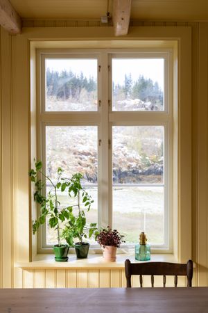
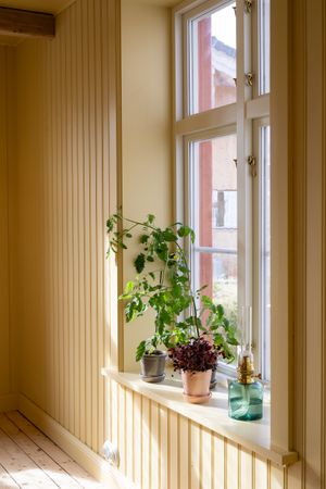
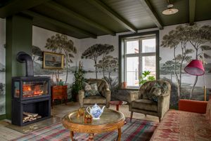
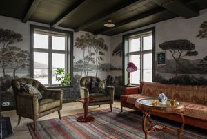
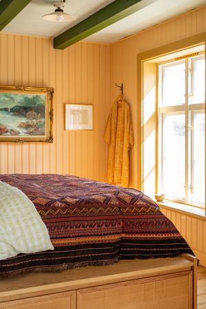
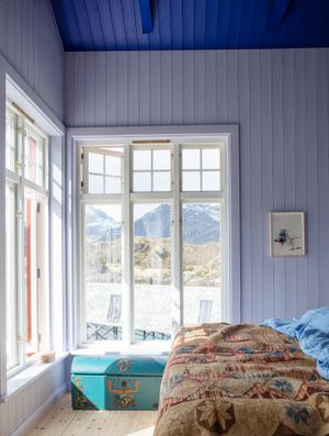
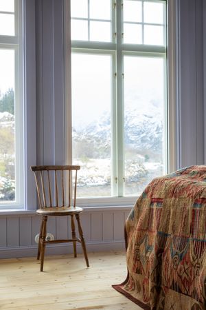
When I walk into the hallway and see the colour Aurora, it feels almost as if I am walking towards the Northern Lights. It is a truly special feeling. In the morning, when I get up and have a cup of coffee in the kitchen, I enjoy the way the morning sunlight reflects off the beautiful yellow hue, Daybreak. It lends an incredible warmth to the room. Later in the afternoon and evening, I find myself naturally drawn to the room with the fireplace. The combination of the wallpaper and the warm colour creates an incredibly cozy atmosphere. It sets the perfect stage for conversation, relaxation, and togetherness. The bedrooms tell their own story. The colours there remind me of sunrise and sunset, embracing the natural light in a very gentle way. One of my favorite experiences is lying in the bedroom, surrounded by lavender fields on the walls and blue on the ceiling. It gives you the feeling of lying beneath an open sky and that is precisely the relationship between colour, nature, and architecture that we had envisioned.”