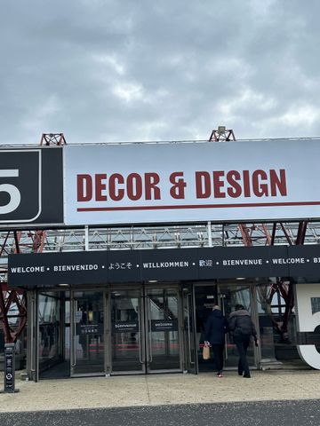
January in Paris is a dream! The streets are covered in decorations, colours and fabrics. Showrooms and pop-up shops are filled with delightful experiences and cosy atmospheres, and the Maison&Objet trade fair is brimming with new products and old favourites!
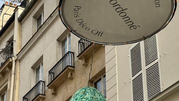
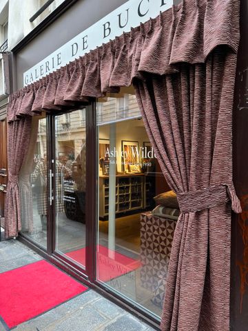
Paris Deco Off and the Maison&Objet trade fair are combined into one major interior design experience in Paris, and are considered one of the most important events of the year in the industry. The event brings together designers, professionals and enthusiasts to view new collections of textiles, colours, wallpaper and furniture. Paris Deco Off takes place in the city’s showrooms and streets along the Seine, providing an intimate and tactile experience of textiles, colours and materials. Maison&Objet is for professionals and gives the industry a broader, more curated view of interiors and design.
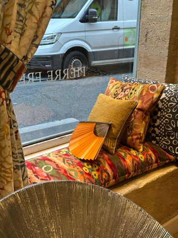
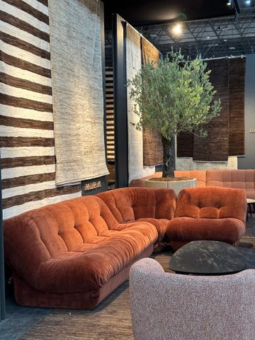
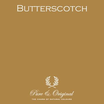
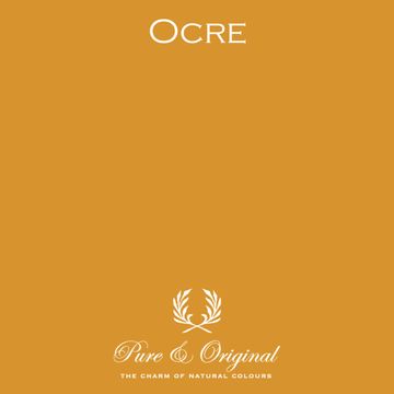
A clear trend is colours that give us calm, but also energy. Our homes should be a sanctuary where we can recharge our batteries, feel safe, and find peace and warmth. Earth tones such as ochre, muted greens and warm reds give rooms warmth, security and a sense of balance.
The imperfect and personal come to the fore with nostalgia, maximalism and reuse. The use of contrasts that create depth and layers gives your home an exciting and personal expression. You can achieve this effect by painting the ceiling, frames, doors and mouldings in addition to your walls. Feel free to use tone-on-tone or contrasting colours.
Another ingenious way to create depth and excitement using paint is to use different degrees of gloss. We have seen this a lot in older buildings that have complex use of mouldings, stucco and rosettes. In new buildings, which are everywhere today, it is even more important to create this excitement. Here, gloss levels are a simple but effective technique. A high-gloss window frame against a matt wall immediately gives the room personality.
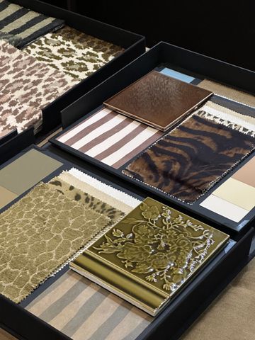
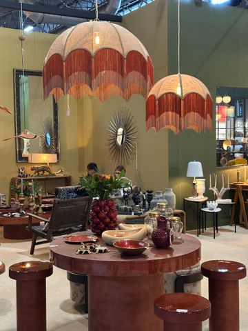
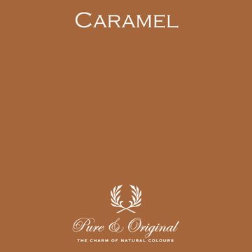
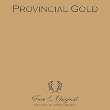
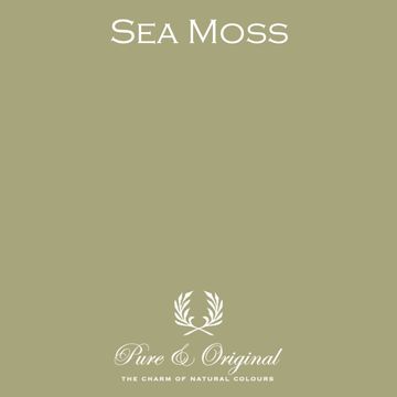
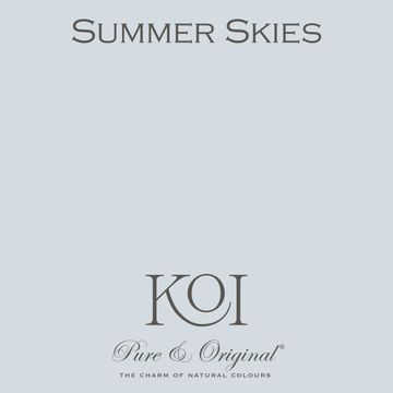
The colours that recur both in the streets of Paris Deco Off and at the Maison&Objet trade fair are ochre yellow, green, sea green, burgundy, red, pink and light blue. We see these colours in different tones of the same shade or in contrast to each other.
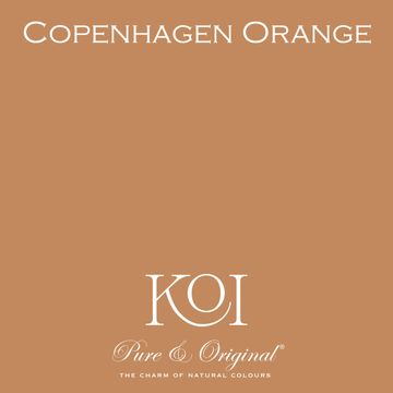
Yellow, ocre and orange
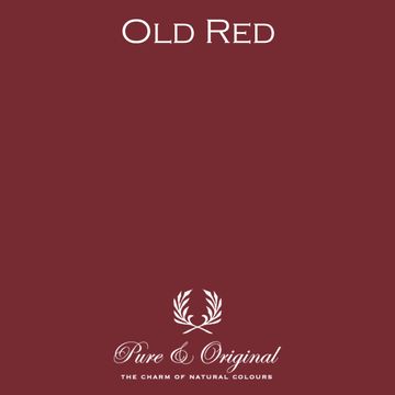
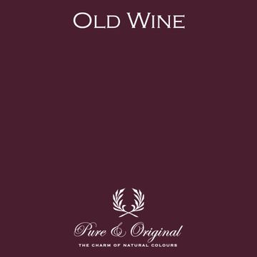
Red, burgundy and pink
Green
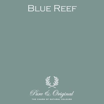
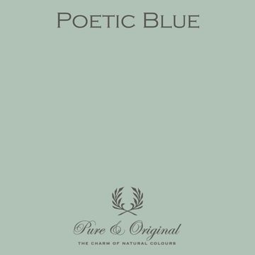
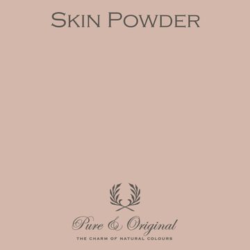
Light blue and warm shades of beige
January in Paris has given us a clear indication of the direction in which the interior design world is moving. Both the trade fair and the streets along the Seine are bursting with colour, personality, historical inspiration and craftsmanship. This is a great pleasure for us.
These days in Paris are important to us. This is where we find inspiration, confirm our gut feelings about colours and qualities, and discover new combinations. We look forward to seeing you colour your home with beautiful colour combinations and natural pigments!